Co-creating a scalable
HMI framework for MG models
Overview
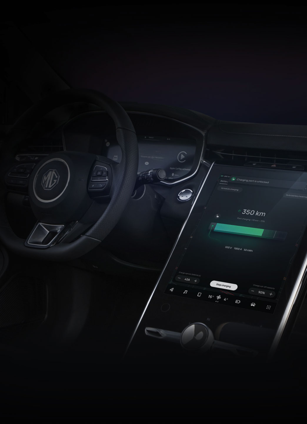
Entertainment, navigation, vehicle diagnostics, connectivity and more, the functionality and control of HMIs are staggering. SAIC discovered an opportunity to expand the capabilities of their HMI for their MG vehicle line to offer more features and expand their market share of millennial drivers.
Based on the success of our previous award-winning MG iSmart HMI, they returned to Star to build on this foundation and deliver an even stronger solution for a global audience.

✓ 2022 UX Design Award nominee
✓ Crafted the iSmart 2.0 HMI design framework
✓ Delivered a final design concept ready for white-labeling across SAIC brands
✓ Enhanced accessibility, inclusivity and ease of use
✓ Incorporated voice control as a key feature
✓ Built with new feature development and vehicle evolution in mind
✓ Refined information architecture to support quick access to core features
✓ Created framework for SAIC designers to build consistent digital experiences
Idea
SAIC began by collecting feedback and learnings from our previous collaboration, tasking us to create a new design language focused on safer, more intuitive automotive experiences set around the following parameters:
- Modularity
- Accessibility
- Reachability
- Ease of use
- Consistency
While our previous work was targeted toward drivers in India and Thailand, our new concept is deployed across SAIC’s global delivery lines.


Project
We started building insights on effective HMI deployments through a competitive analysis of industry leaders such as BMW, Audi, Mercedes and Tesla.
Combined with the data SAIC collected from our previous collaboration, we had a strong foundation to establish what resonates with users.
We then structured the project into four phases, taking into account user needs for holistic in-vehicle UX:
- Experience: focused on visual research and experience detailing; ideation workshop with SAIC team that would align teams on the HMI design hypothesis.
- Interaction: experience modeling stream to get the full picture of how the interface works and how people interact with it.
- Visual Design: detailing and concept polishing, UI library creation; finalization of end-to-end design HMI experience and theming framework support.
- Animation: creative motion ideas around UI transformation, reactions, physics, and dynamic feedback.
Although we incorporated an array of new functionalities into our HMI interface design, we intentionally designed the iSmart 2.0 around familiarity and ease of use. Unlike other major brands, we included tablet-inspired navigation for intuitive movement and quick-access points to key apps.
To ensure appropriate linguistic and cultural aspects for a particular region, we ran a series of cross-language tests, automating the testing process by integrating Lokalise and Font Replacer plugins to speed up the translation process.
The design language of iSmart 2.0 HMI solution is robust, supporting different screen layouts to match any of SAIC’s global brands.
Inclusivity, flexibility and sustainability are essential to our HMI development co-creation. Likewise, voice control keeps user attention focused on the road. Features such as voice control ensure ease of use and increased accessibility.
iSmart 2.0’s strongest advantage for SAIC is that it can be applied to any of its vehicle lines across markets. It is modular and easily updated, promoting vehicle longevity, brand identity and a strong relationship between the end user and the MG brand.
Project scope
- Design Research
- Interaction Design
- Visual Design
- Motion Design
Share
Share


