

A doctor's visit is only 17.4 minutes long, shorter than the average TV show. We all know how challenging it is to cover all the complexities of health in such a limited time.
But the right healthcare app development can change that. By providing synthesized and easy-to-understand insights, these wearables give healthcare providers a more complete view of patient health. This couldn't come at a better time, as the global user base for smartwatches and smart bands is projected to reach 230 million by 2027. The technology, the demand and the impact are there, especially MedTech and pharma companies increasingly leverage digital healthcare solutions.
Healthcare UX design is foundational to driving user engagement, improving the patient journey and reducing friction. In this guide, we share the fundamentals of UX for designing better smartwatches and smart bands. While the considerations may vary depending on the type of wearable, the importance of prioritizing UX remains constant.
Rules for healthcare UX design
The user experience of smartwatch apps has to be carefully crafted. While there's similarities with smartphones, it's important to recognize the distinct differences between these devices.
Smartwatches and smart bands have smaller screen sizes than smartphones, and they come in both square and round shapes. They usually also have smaller batteries and less processing power. Unlike smartphones, they're worn on the wrist and operated with one hand (unless equipped with gesture recognition).
With these differences in mind, here are the ten most important healthcare UX design rules for wearable app and smartwatch development, viewed through the lens of MedTech and FitnessTech examples.
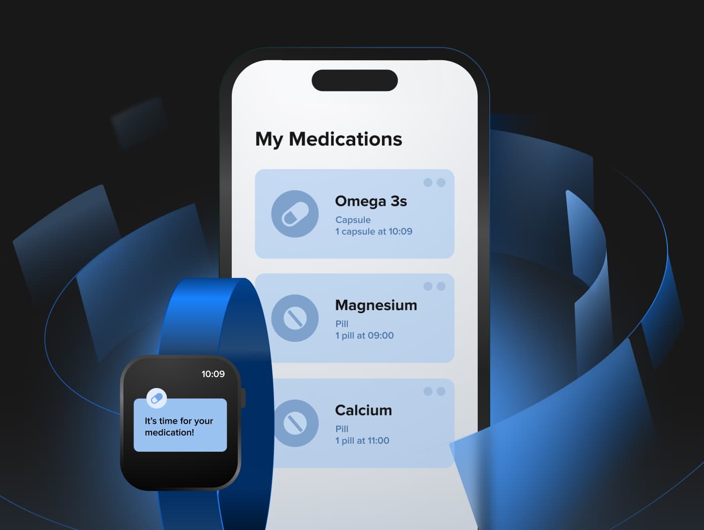
1. Harness the power of paired phones
Many third-party smartwatch apps offer companion mobile apps, taking advantage of each device's strengths. Mobile apps excel in handling complex tasks that require extensive input and information-rich screens, such as displaying weekly, monthly, or yearly statistics.
On the other hand, smartwatches shine in providing quick and effortless interactions, offering immediate access to specific information and functionalities when needed.
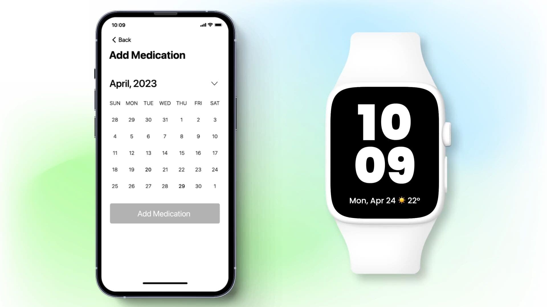
In this medication tracking app, certain features like adding medication details, setting medication routines, or accessing multiple-day adherence reports are integrated into the smartphone-based companion application.
The watch is perfect for displaying medication reminders and allowing users to easily log whether they have taken or skipped their medication. All of this data can then be presented on a healthcare provider (HCP) dashboard, ideally within Electronic Medical Record (EMR) software, showcasing the information in a structured and user-friendly manner.
2. Show fewer options
The limited screen space on smartwatches requires extra design effort to ensure users can grasp the content at a glance. This is especially crucial for action screens, while information screens can accommodate slightly more data. Visuals, animations and micro-interactions should be utilized to enhance comprehension rather than serving as distracting embellishments.
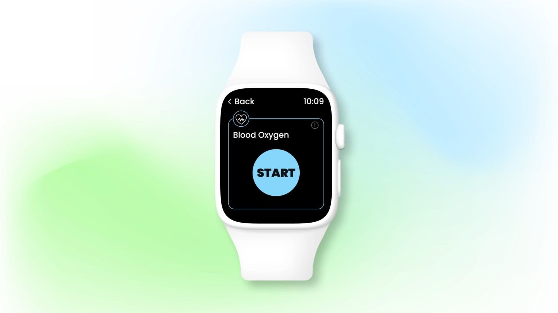
Each action — initiating the measuring, the measuring itself and a confirmation of successful completion — has a dedicated screen with a clear focus. The countdown animation makes it crystal clear to the user how long they must wait for the final result.
3. Reduce complexity and interactions
Given the limited attention span of smartwatch users, it's crucial to minimize the number of steps in a process.
Complex hierarchies and flows must be avoided, so the user doesn't have to dig deep into an endless sequence of small screens.
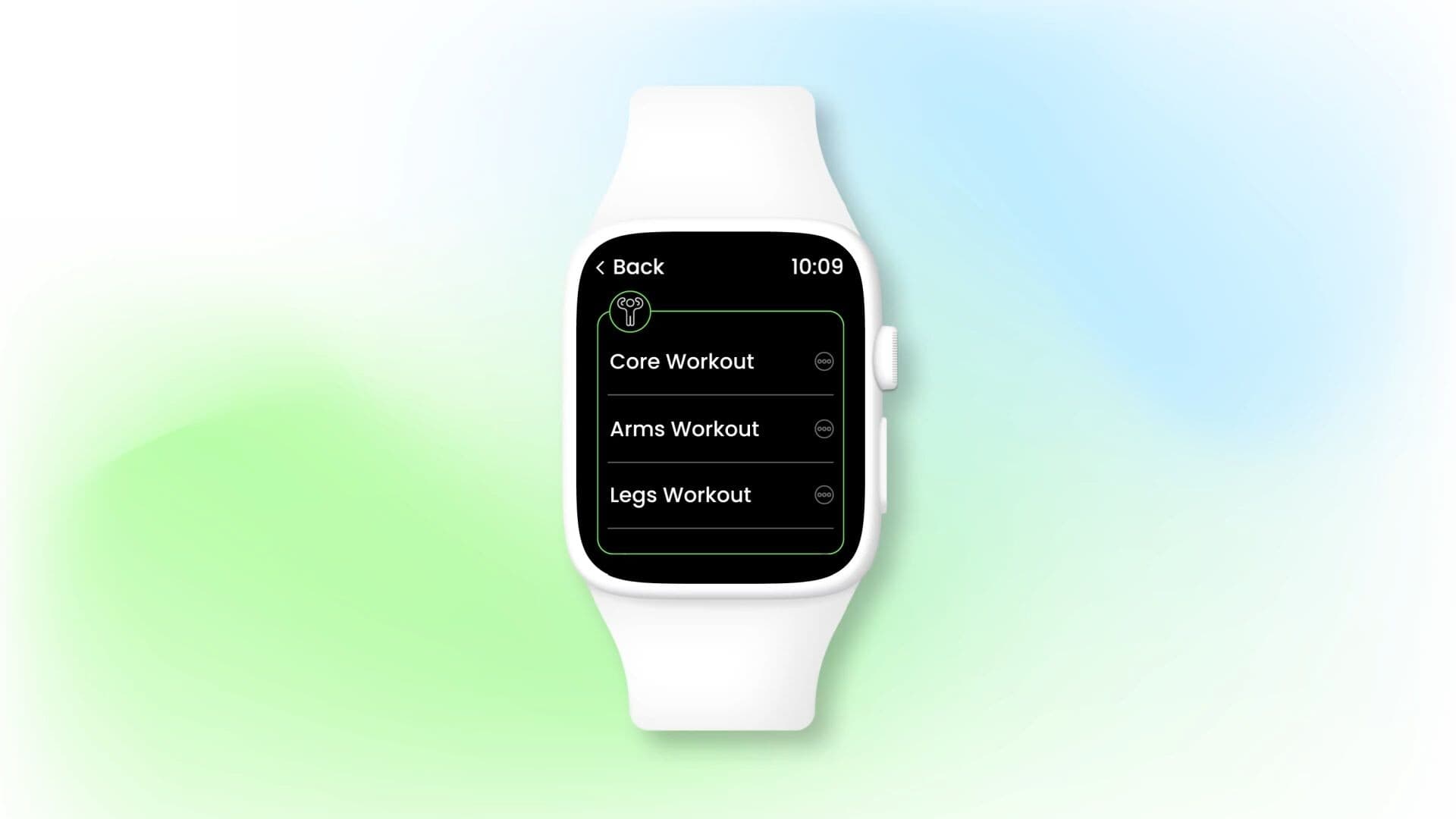
The only steps the user needs to go through to start the training are:
- Scrolling through different workout types
- Tapping the appropriate one to select it
- Tapping again to initiate the session
4. Use simple and memorable gestures
Due to the small display, which doesn't allow for placing multiple buttons, smartwatches use universal patterns for specific gestures, which should be simple, consistent and easy to remember.
Swiping left is a good example — in the world of smartwatches, it usually takes us to the previous screen. Gestures such as dragging are acceptable but a simple tap is more reliable.
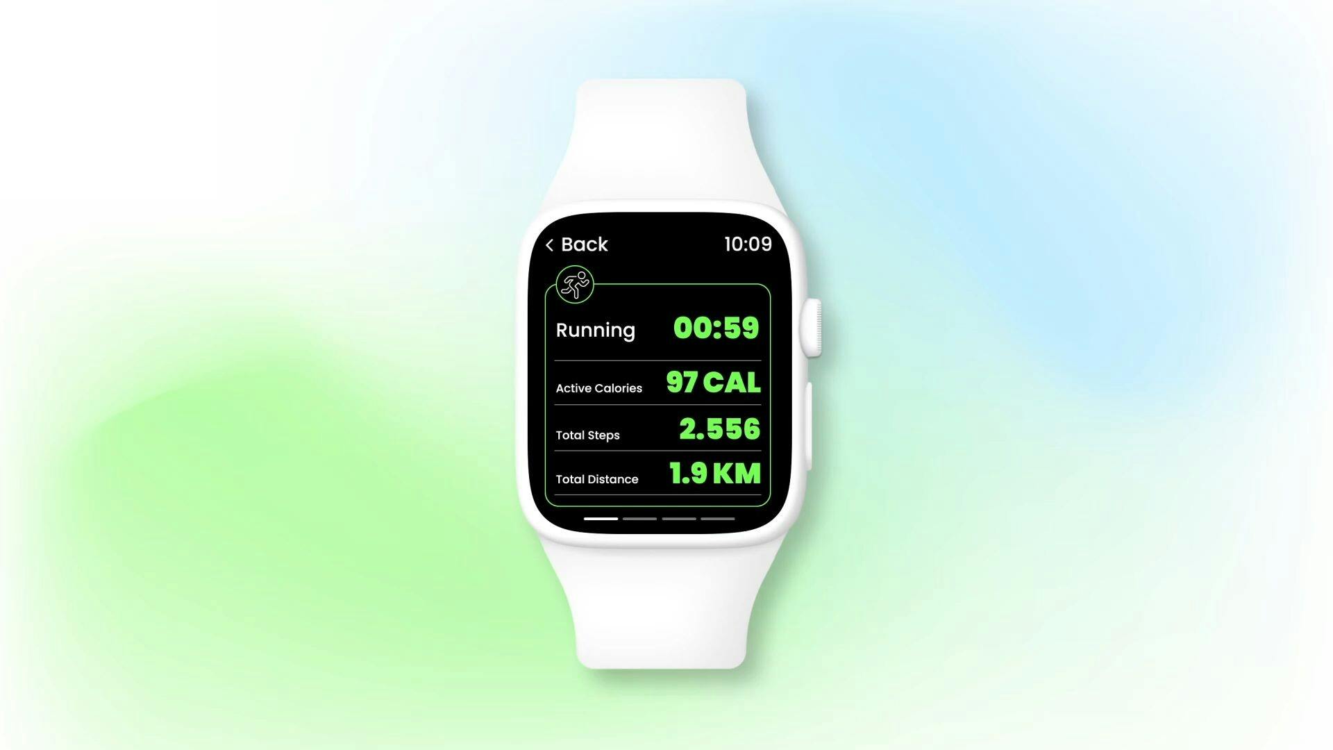
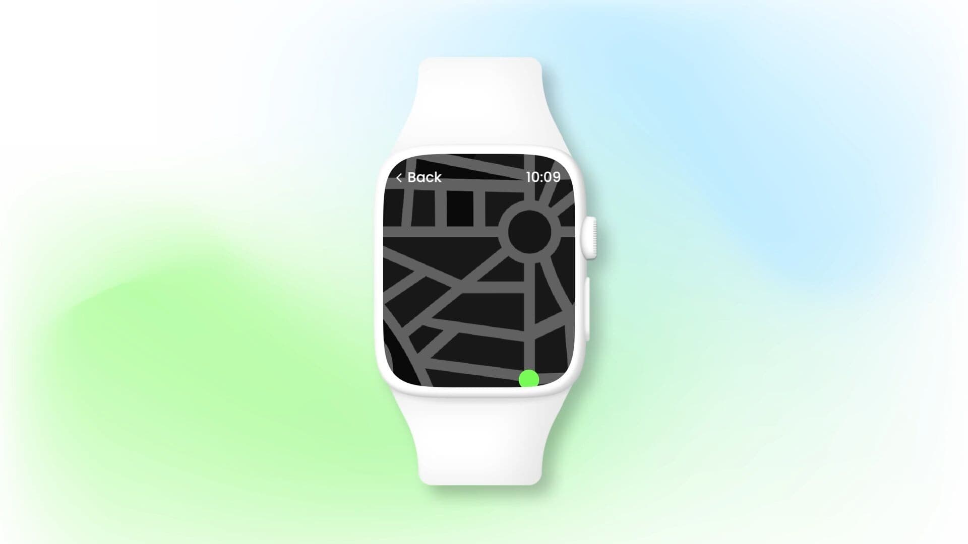
Workouts generate significant amounts of data and viewing all of it in a single screen would be cumbersome. By creating multiple parallel screens, each with a different set of information, and allowing users to swipe left and right between them, users can access all data without compromising readability or increasing cognitive load.
5. Effortless data input
Most smartwatches have one main mode of interaction which is touch. Inputting data on a small display using a finger is challenging. Therefore, the best healthcare UX design practice is to use selection over typing when possible. If typing can’t be avoided, alternatives to a keyboard are worth considering, such as voice or shifting the interaction to a paired companion app.
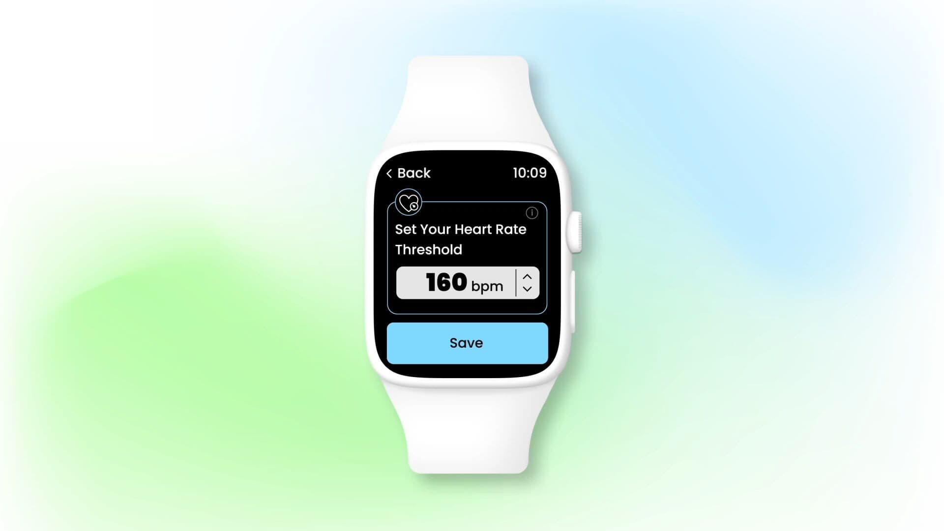
Users can set a heart rate threshold that will trigger a warning notification. This can be achieved by swiping the spinner with values instead of surfacing a numerical keyboard.
6. Prevent unintentional actions
Because smartwatches are worn on an exposed, often moving part of the body, they're prone to accidental skin contact, which can trigger unwanted actions. Therefore, double confirmation or long-press is advisable for confirming critical actions.

For example when a workout is over, the user first needs to swipe horizontally to reveal the pause/stop screen and then tap and hold the stop icon for a couple of seconds until the loading animation closes the circle. This significantly reduces unintentionally ending the session.
7. Convey meaning with micro-interactions and haptics
Some messages are best conveyed by means other than text. Micro-interactions provide single, focused feedback to the user. Haptics bring the user's attention to something that requires it at a specific moment. The combination of the two makes the interface feel more responsive, alive, engaging, and satisfying to the user.
In a running app, haptic feedback is used in addition to visual prompts to let the user know where to turn next. One vibration pattern is assigned to turning right, and another to turning left. This way the user can easily navigate without having to look at the screen.
8. Sans Serif and bold fonts for clear display
Font matters a lot in UX, and it's no different with healthcare apps. Serif fonts are something we discourage using. Instead, Sans Serif and bold fonts are good picks that will make the display clean, spacious, and sharp.
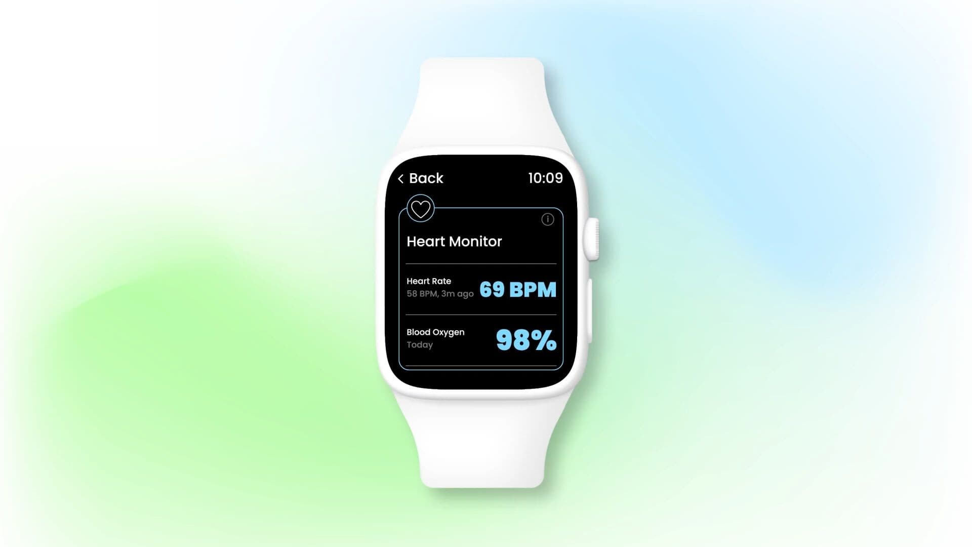
Heart activity readings are presented in large, bold fonts to help users clearly see and remember them. The accompanying text is Sans Serif, facilitating a clean viewing experience.
9. Color contrasts for sharpness and legibility
Colors are used both for aesthetic reasons and to help the user distinguish between important and less important elements. We often recommend black backgrounds as they provide sufficient contrast and blend well with desaturated colors, which are easier to read and soothe the eye.
Monochromatic palettes are very good for distinguishing different elements of the same visual theme. Bright colors help things stand out and are best for graphic elements.
Above all, whatever colors you choose, keep them within a consistent visual theme that matches the character and purpose of the app.
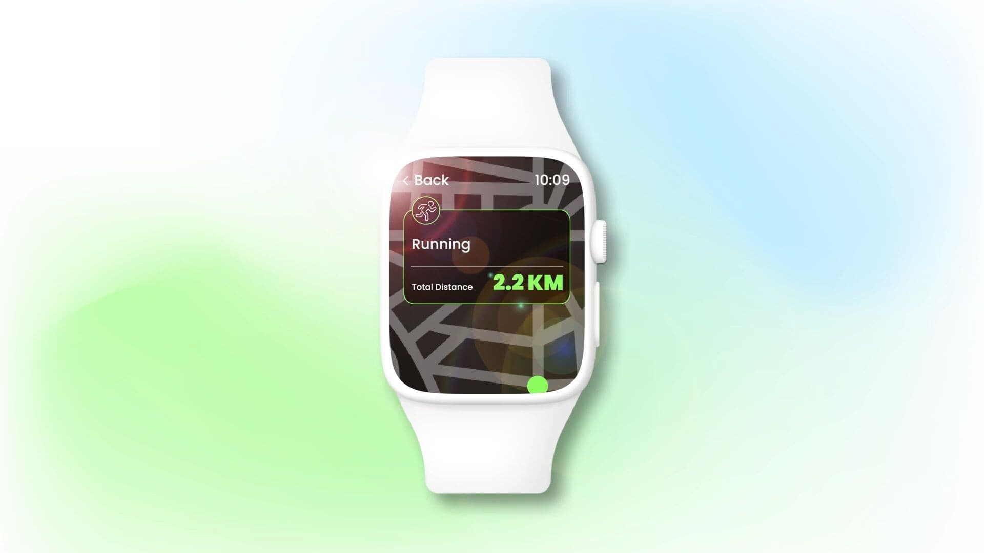
The route and distance are clearly visible in all lighting conditions. This is made possible by using bright colors to highlight these elements.
10. Use icons for instant understanding
Glanceability is a virtue that every smartwatch app should take pride in. So, how can you achieve it? Often, graphic elements such as icons can help users assess the situation much faster than text.
In healthcare apps, pairing medical-themed icons with corresponding features helps users quickly identify the function they are looking for. This can be especially important for individuals who are ill or chronically ill and may have difficulty concentrating serving as a vital directory for navigating the app in such cases.
What's next for healthcare wearable app development?
Smartwatches and smart bands are critical in the shift towards preventive medicine, personalized healthcare and promoting active lifestyles. Considering the already large and lucrative market for them, entering the healthcare wearables domain with the right UX design approach is a brand-differentiating opportunity for engagement-driven digital therapeutics and software as a medical device solutions.
Make your mark on healthcare. Get in touch with us to see how we can help best leverage healthcare UX design to craft and evolve exceptional healthcare products.