


Financial services providers need to adapt to the speed at which the FinTech industry is moving. This means embracing data visualization and dashboard technologies. In order to stay competitive, it’s vital dashboards are created with efficiency and the end user's needs at their heart.
So what are the foundations of a powerful dashboard? Regardless of your FinTech sector — wealth management, investment banking or digital payments — they rarely change. The dashboard should tell the data’s story, be easily consumed and offer the ability to compare past performance. If done successfully, the benefits are endless: the impact of the data is enhanced, complex information becomes easily interpreted and new insights are found.
This article uncovers the foundations of any successful dashboard and what FinTech providers are doing to elevate their dashboards to the next level.
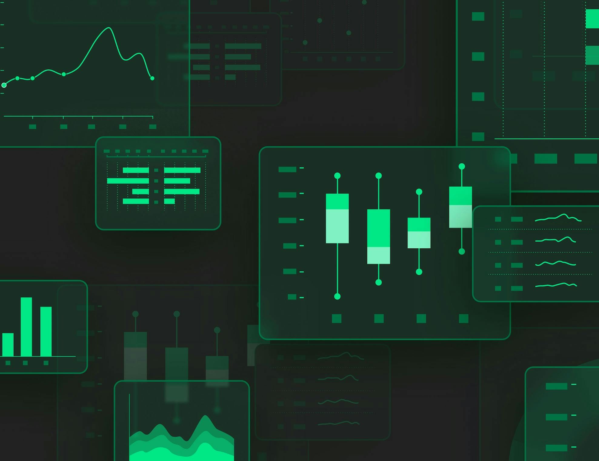
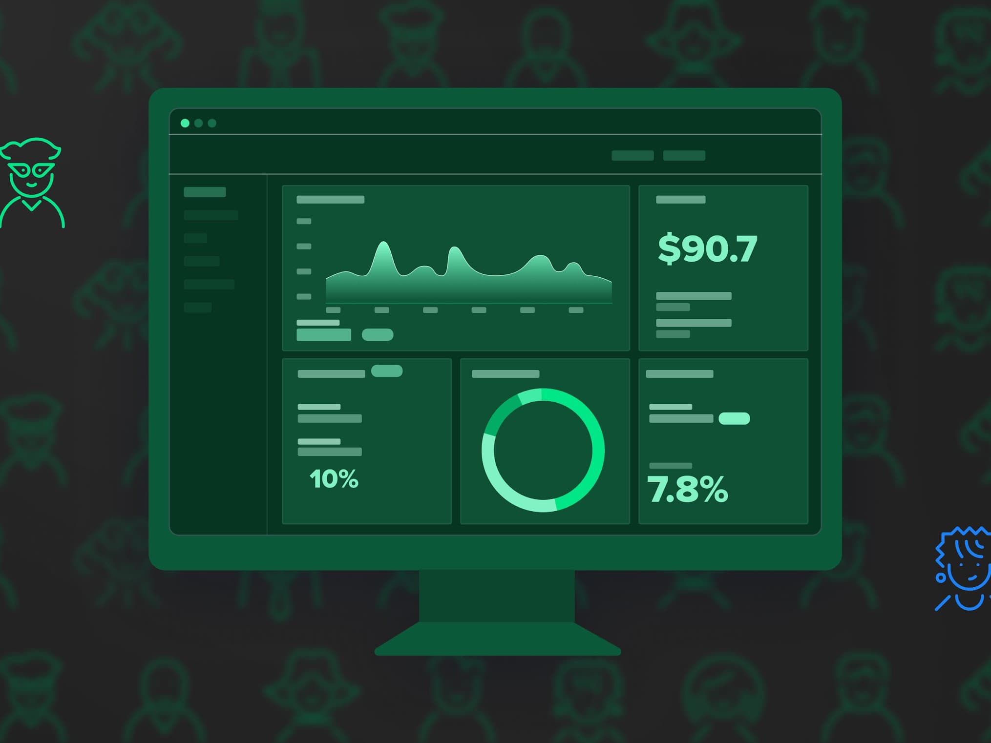
Digital dashboards: the what and the why
Dashboards are no longer just a visual representation of data. Any well-designed dashboard should be considered equally from a visual and informative standpoint. They're a go-to hub for tracking key performance indicators (KPIs), business metrics and comparing past performance. They morph data from various sources in a user-friendly manner to assist users when making informed decisions — leading to enhanced productivity and greater collaboration from your team. We've outlined a few of the benefits below.
Drive productivity and accountability
Following a study by Harvard Business Review, researchers noticed that people's productivity levels that digested an overload of information in smaller sections were higher than those that didn't. This simple concept is critical to the success of any contemporary dashboard. They should aid the end user's productivity by allowing them to understand the data with limited prior knowledge and enabling them to turn this information into actionable steps for improvement.
Accelerate and improve decision making
A dashboard should highlight the most critical metrics and KPIs for better decision-making and situational understanding. Considering this, the end-users interpretation must be incredibly accurate — as future business decisions can rely on it. More dashboards are also opting to use artificial intelligence (AI) and machine learning (ML) to extract more specific information while reducing the possibility of human error and broadening the potential for longer-term success.
Strengthen communication and collaboration
Two heads are often better than one. When information in a dashboard is actualized with the right visuals and hierarchy, it creates more opportunities for people's opinions from varying verticals, industries and backgrounds. It also means that in having more people that understand the data, there's a reduction in disputes related to misunderstandings.
The different dashboards in FinTech
Even though the application of dashboards has proven helpful across several industries — it's been FinTech in particular where they've been utilized as an invaluable tool.
Revenue dashboard
A revenue or financial performance dashboard aims to give a high-level perspective of how a company's revenue should be spent. It also highlights key parameters that influence the overall balance of the organization. This type of dashboard includes metrics like working capital ratio, return on assets, return on equity and debt-equity ratio. These allow users to get an overview of revenue liability and investment opportunities, which is essential for tracking real-time success.
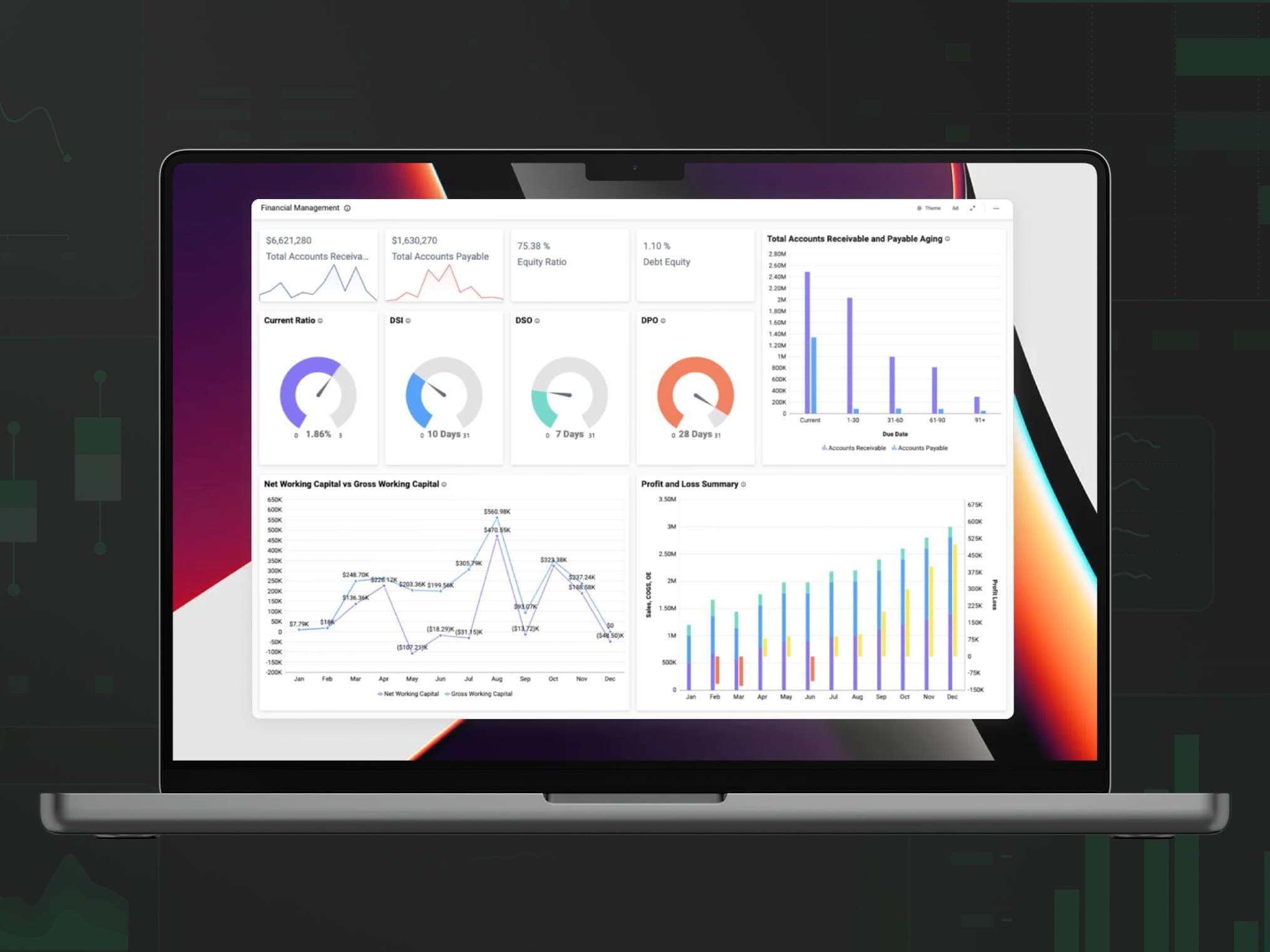
Example: boldbi.com
Bold BI’s financial performance dashboard supplies a detailed overview of a company’s key metrics. This data is essential for CEOs or other executive leaders. Metrics such as net working capital, current ratio, accounts receivable and payable are shown here.
Cash flow dashboard
Rather than focusing on the overall balance, cash flow dashboards focus on the current cash flow situation for business and individual use. For businesses, it gives the present and immediate ratios to determine the bank's ability to pay off debts and improve financial health. For individuals, it provides an overview of daily, monthly, and yearly income and spending, allowing users to keep track of where their money is going. This type of dashboard can also give budgeting suggestions for users based on their spending habits.
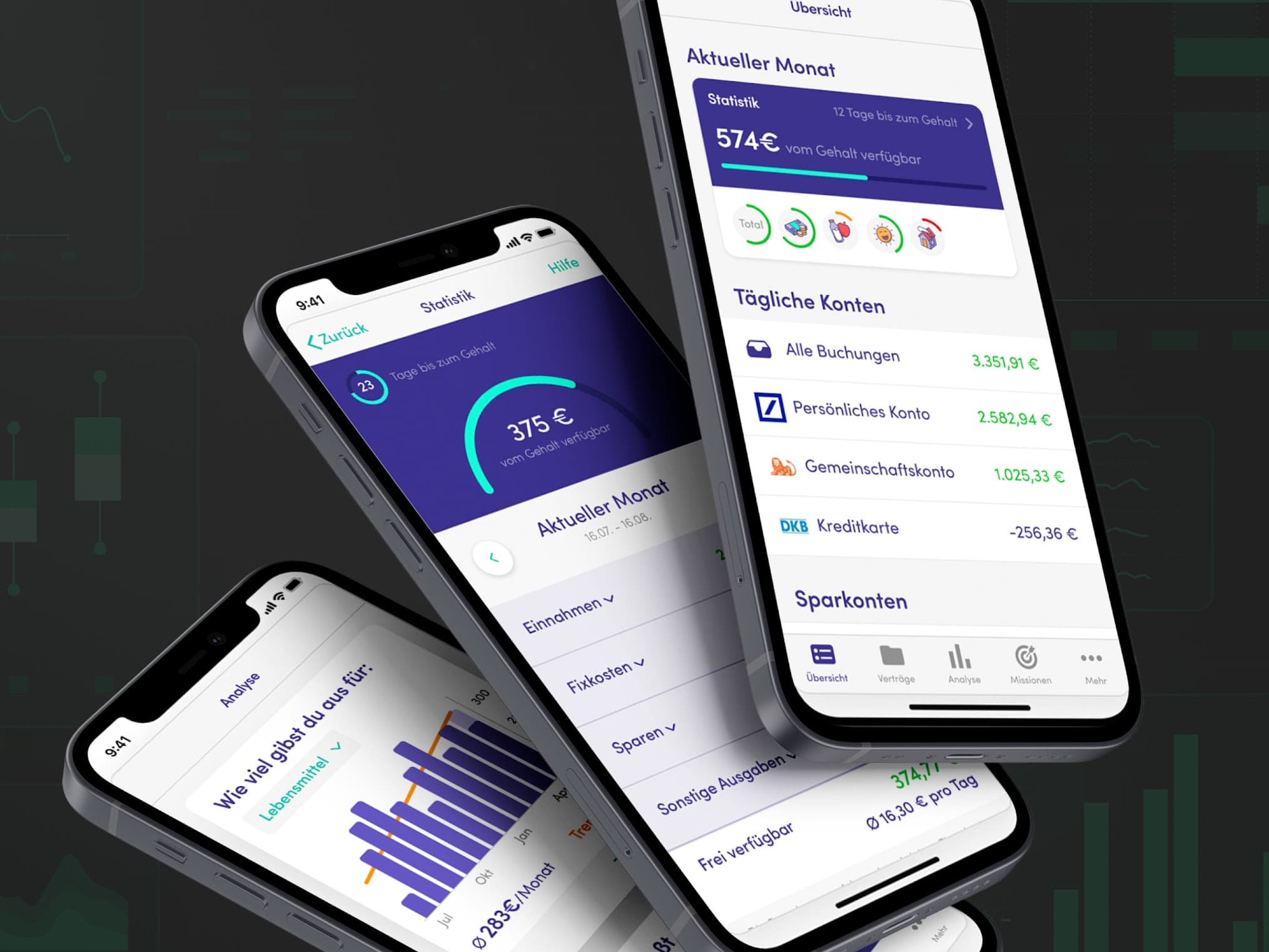
Example: finanzguru.de
Finanzguru is a German-based startup that recently won 8 million euros in funding. The app offers personal finance dashboards that show an overview of the monthly cash flow situation. It also gives users personalized saving tips based on spending patterns and graphical analysis to optimize individual spending.
Profit & loss dashboard
Profit and loss dashboards indicate revenue, expenses and costs incurred over any fiscal year. They also outline why a business made or lost money and identify innovative ways to reduce unnecessary costs and increase the overall profit. Common KPIs for this type of dashboard include gross profit margin, net profit margin, operating expense ratios, and operating profit margin.
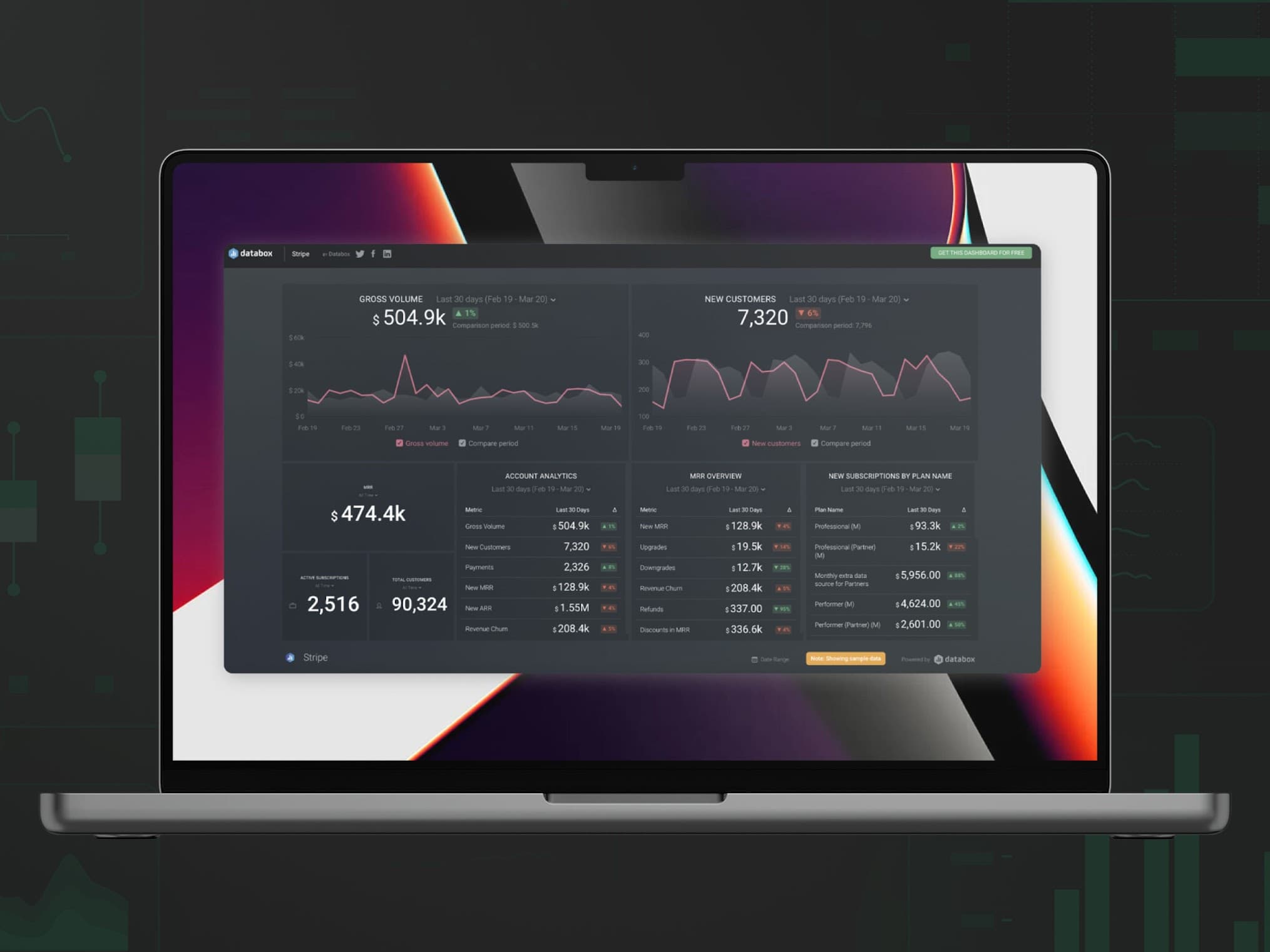
Example: databox.com
Databox offers profit and loss dashboards with some of the most commonly tracked metrics including profit margin, costs, and expenses. This provides the management essential information about the company’s ability to generate profit. Here end-users can customize the period of time to be tracked on the dashboard.
Expenses dashboard
There are two types of expenses dashboards: business expenses and personal expenses. The business expenses dashboard helps a company understand its accounts receivable and payable status. This dashboard's two important metrics are accounts payable turnover ratio and accounts receivable turnover ratio. Personal expenses dashboards are used to monitor and measure individual financial performance — and assist users in gaining a deeper understanding of their present financial situation and identifying areas where spending is disproportionately high vs. industry benchmarks.
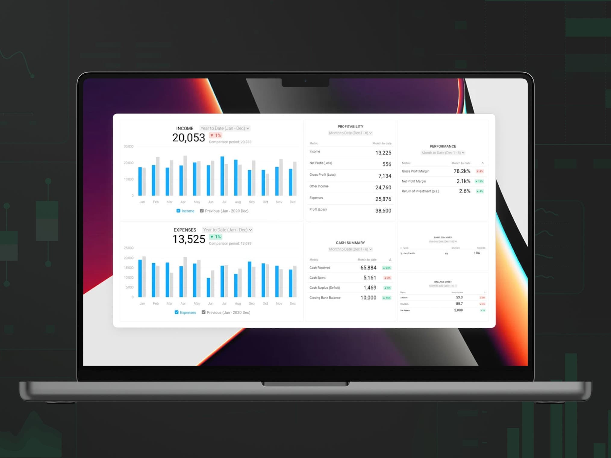
Example: databox.com
Databox’s expenses dashboards track some of the most common expenses metrics and KPIs and analyze expenses performance by clicking on a metric. This type of dashboard highlights accounts receivable and payable status.
Maximize the potential of expense-tracking software to differentiate your brand and improve employee satisfaction
Wealth management dashboard
This dashboard aims to report and evaluate stock movements to better allocate future investments and increase the understanding of the market, allowing portfolio managers and individual investors to stay informed about portfolio performance and allocations. They often report and analyze stock trends in real-time and allow users to change allocations.
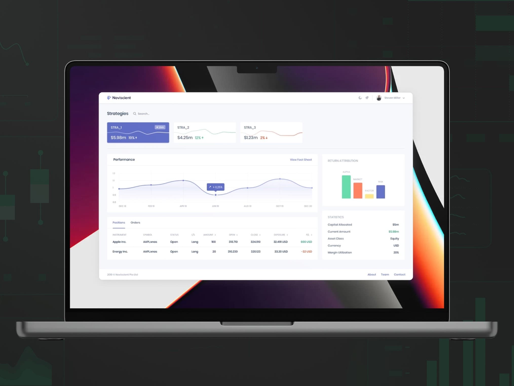
Example: noviscient.com
Noviscient offers investment management dashboards that track portfolio performance in real-time and allows investment managers to dynamically allocate investment. They use machine learning to provide customized solution strategies for investors.
What are the best practices for dashboard design and creation?
Now that we’ve established that data visualization dashboards aren’t simply "plug-and-play" — but rather a composite of components that vary between types of dashboards — what practices should FinTech providers consider when creating their own dashboard?
1. Knowing your end user
Will the dashboard be used by data analysts and scientists or simply non-technical users who need an intuitive interface? The book Storytelling with Data states it plainly, saying "the more specific you can be about who your audience is, the better position you will be in for successful communication."
Creating user personas, customer journey maps and conducting questionnaires are valuable techniques for digging further into end-user needs when applying design thinking in FinTech. The questions below are useful when outlining a blueprint of your dashboard:
- What are your organization's key strategic goals?
- What do you wish to improve in your business?
- Why do you want to improve this?
- What types of data do you want to analyze?
2. Telling a story with the right data
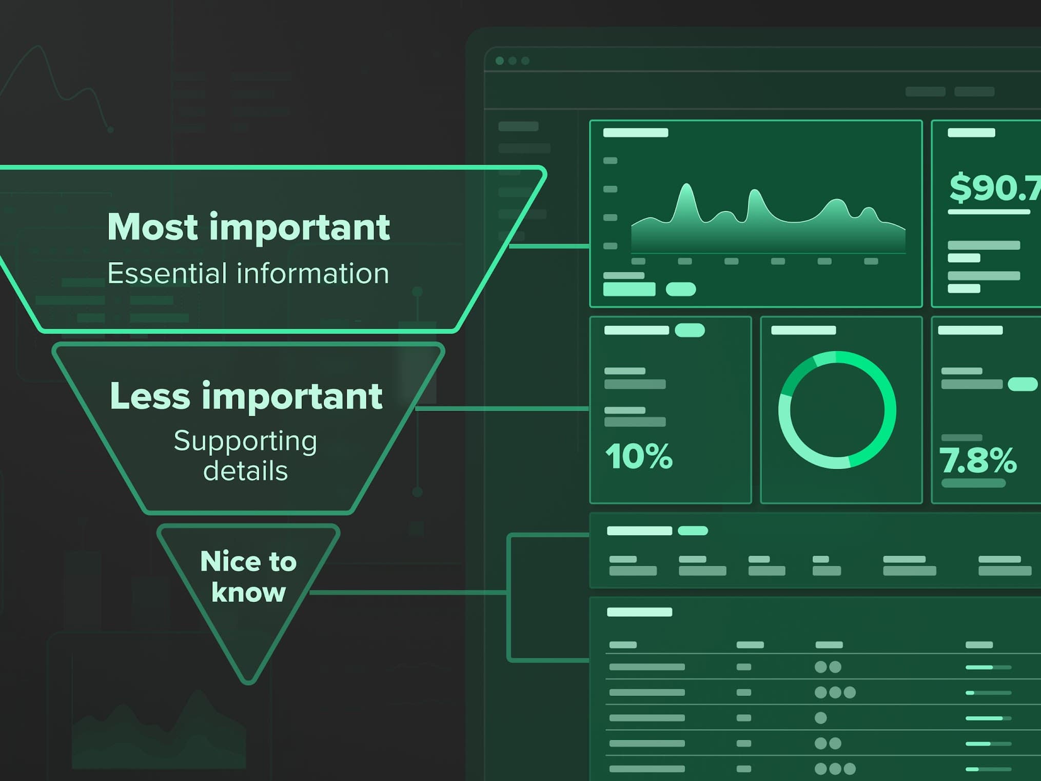
The prioritizing of data plays an essential role in the success of your dashboard. Which data is essential and which is secondary? Choosing the right metrics is crucial. Effective metrics should be actionable, transparent and have a shared interpretation across your entire organization. The inverted pyramid principle used for content writing applies to dashboards as well. Keep what matters most in the spotlight.
Common mistakes in dashboards include having irrelevant data or displaying too much data. Consider what value each of the data visualizations adds to the dashboard. Would eliminating it from the dashboard reduce its effectiveness if there is no clear or evident benefit?
3. Choosing the right visuals
Data visualization is all about giving a voice to datasets and allowing them to speak for themselves. By selecting the right way to highlight your data and create a visual hierarchy, you can prevent the dashboard from looking cluttered, giving more space for the end-user to focus on what's essential.
The world of data visualization contains many possibilities for displaying information. Don't be afraid to step beyond traditional bar graphs and pie charts.
4. Defining efficient interactions
The effort required when viewing a dashboard's visuals should be minimal. Filters, actions and other interactions should align logically with the end-user workflow. Does your user need to filter information by date, time, location or client? Is it evident that those actions are possible when viewing the dashboard?
It's also necessary to define how you want your end-user to interact with the data. Determine the drill-down capabilities by allowing users to shift from an overview to a more detailed view of the data when clicking on any given metric.
5. Investing in the right technologies
Data analytics and visualization technology combine several processing techniques and methods. There's an increasing number of financial dashboard software and tools, including Microsoft Power BI, Google Data Studio and Tableau, but how do you ensure you're investing in the right technology?
Understanding the types of data your company wants to analyze should be the first priority. Secondly, decide who the end-user of your dashboard will be: data analysts or non-technical users? Some platforms focus more on point-and-click analysis for less technical users, while others give an interactive experience for iterating on code development.
A good dashboard tool should start with solid integration to enterprise resource planning (ERP) systems and enable financial users to develop and modify reports and dashboards without relying on technical specialists.
Elevating your dashboard to the next level
Once you've established a strong foundation, it’s important FinTech providers continue to seek means of taking their data visualization to the next level. So what does this look like?
Merging visualization with virtualization
Humans create over 2.5 quintillion bytes of data every day, the majority of which is unstructured and unusable. One of today's biggest challenges is to increase the usability of data that hasn't previously been tapped into.
Data virtualization integrates all company data across systems, managing it for centralized security and control, and delivers it in real-time to users. We can use data virtualization to build a platform for efficient data visualization by identifying data silos, bringing data from various sources into one and extracting only the essential data.
Machine learning for data insights and forecasts
Instead of stopping at data visualization, a dashboard could give the user direct and clear insights through artificial intelligence. Once a user has defined specific parameters for goals, the data can be automatically interpreted. Machine learning enables accumulated data for forecasting, finding irregularities and auditing. This can reveal previously hidden information in data and anomalies.
Have you considered harnessing the power of your data into a dashboard? Data visualization and FinTech product design are Star’s key areas for accelerating the success of our partners. Our FinTech experts discussed this in our podcast with Monavate.
Explore how dashboards and data visualization can advance your business and increase the potential for success with our Star Experts.